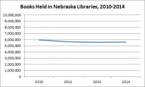
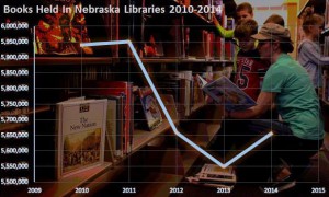
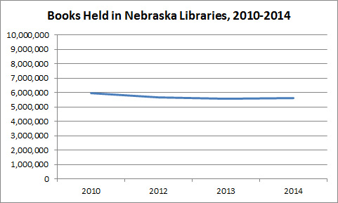
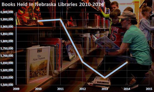
Today’s post will focus on line charts (or graphs, if you prefer). The Dude thought about this in response to the graph (second from the top, on the right) that NET posted on its website to supplement the recent 5 part
LIBRARIES: The Next Chapter series. At first, the Dude took note of the Y-axis of the NET chart (it’s the one with the books and readers in the background), remembering some rule that says to
always start these charts (and bar charts for that matter) with 0. So today’s post will take a look at the line chart and axes, and next week’s post will most likely take a closer look at this data and something called context. Note that the data from these charts is from the annual public library survey.
In 1954, Darrell Huff wrote a book called
How to Lie with Statistics. One of the main takeaways of Huff’s book is the notion that bar and line charts should always start the Y-axis with 0. Anything other than 0 is a fabrication or at least a misrepresentation, according to Huff. The Dude created the first chart, top right, which illustrates the same data that appears on the NET chart. The only difference is the Y-axis starting at zero on the top chart, and 5.5 million on the bottom chart. Both charts illustrate an overall decline of 5.67% in paper book holdings from 2010-2014, or a decline of 6.56% from 2010-2013, and an increase of .95% from 2013-2014. Taking into consideration the differences in both of these charts, which one is a better illustration of the data? Well, maybe neither one of them.
The Dude is a huge fan of data statistician Nathan Yau. If you haven’t seen some of his data visualizations on
FlowingData, check them out. So for this general question, namely, should the Y-axis always start at zero, the Dude consulted Nathan Yau. Ironically, Nathan’s FlowingData website had a post on the main page about this very topic, and if you have a chance, the Vox video he links to in
his article is well worth the two and a half minutes. The gist is that the Y-axis need not always be zero, but the most important thing, as the Vox video illustrates, is context.
Originally, the Dude admits that he thought that the NET chart misrepresented the decrease in paper books held by Nebraska libraries (by illustrating a much larger decrease than actually occurred), but isn’t the
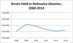
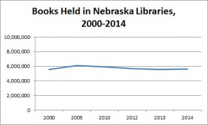
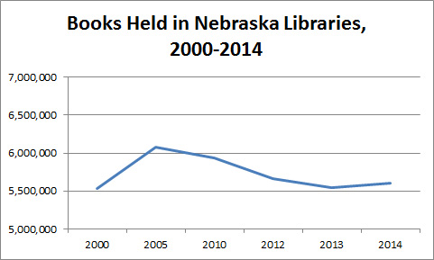
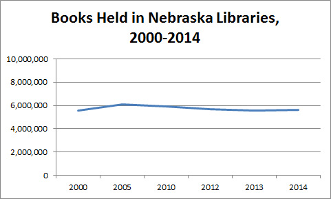
increase illustrated from 2013-2014 just as misleading, since it tends to show a sharp and somewhat dramatic increase from 2013-2014 when in actuality the figure is less than 1%? Also, does the first graph at the top fail, in that it doesn’t show any change at all, or very little? If we expand the data back to 2000, we get a different illustration of the trend (see third and fourth right, with two different Y-axes). The real question here, generally speaking, after looking at the data, is the greatest of all philosophical questions: So what? That’ll hopefully be the topic for next week. Shaka.
 Today’s post will focus on line charts (or graphs, if you prefer). The Dude thought about this in response to the graph (second from the top, on the right) that NET posted on its website to supplement the recent 5 part LIBRARIES: The Next Chapter series. At first, the Dude took note of the Y-axis of the NET chart (it’s the one with the books and readers in the background), remembering some rule that says to always start these charts (and bar charts for that matter) with 0. So today’s post will take a look at the line chart and axes, and next week’s post will most likely take a closer look at this data and something called context. Note that the data from these charts is from the annual public library survey.
In 1954, Darrell Huff wrote a book called How to Lie with Statistics. One of the main takeaways of Huff’s book is the notion that bar and line charts should always start the Y-axis with 0. Anything other than 0 is a fabrication or at least a misrepresentation, according to Huff. The Dude created the first chart, top right, which illustrates the same data that appears on the NET chart. The only difference is the Y-axis starting at zero on the top chart, and 5.5 million on the bottom chart. Both charts illustrate an overall decline of 5.67% in paper book holdings from 2010-2014, or a decline of 6.56% from 2010-2013, and an increase of .95% from 2013-2014. Taking into consideration the differences in both of these charts, which one is a better illustration of the data? Well, maybe neither one of them.
The Dude is a huge fan of data statistician Nathan Yau. If you haven’t seen some of his data visualizations on FlowingData, check them out. So for this general question, namely, should the Y-axis always start at zero, the Dude consulted Nathan Yau. Ironically, Nathan’s FlowingData website had a post on the main page about this very topic, and if you have a chance, the Vox video he links to in his article is well worth the two and a half minutes. The gist is that the Y-axis need not always be zero, but the most important thing, as the Vox video illustrates, is context.
Originally, the Dude admits that he thought that the NET chart misrepresented the decrease in paper books held by Nebraska libraries (by illustrating a much larger decrease than actually occurred), but isn’t the increase illustrated from 2013-2014 just as misleading, since it tends to show a sharp and somewhat dramatic increase from 2013-2014 when in actuality the figure is less than 1%? Also, does the first graph at the top fail, in that it doesn’t show any change at all, or very little? If we expand the data back to 2000, we get a different illustration of the trend (see third and fourth right, with two different Y-axes). The real question here, generally speaking, after looking at the data, is the greatest of all philosophical questions: So what? That’ll hopefully be the topic for next week. Shaka.
Today’s post will focus on line charts (or graphs, if you prefer). The Dude thought about this in response to the graph (second from the top, on the right) that NET posted on its website to supplement the recent 5 part LIBRARIES: The Next Chapter series. At first, the Dude took note of the Y-axis of the NET chart (it’s the one with the books and readers in the background), remembering some rule that says to always start these charts (and bar charts for that matter) with 0. So today’s post will take a look at the line chart and axes, and next week’s post will most likely take a closer look at this data and something called context. Note that the data from these charts is from the annual public library survey.
In 1954, Darrell Huff wrote a book called How to Lie with Statistics. One of the main takeaways of Huff’s book is the notion that bar and line charts should always start the Y-axis with 0. Anything other than 0 is a fabrication or at least a misrepresentation, according to Huff. The Dude created the first chart, top right, which illustrates the same data that appears on the NET chart. The only difference is the Y-axis starting at zero on the top chart, and 5.5 million on the bottom chart. Both charts illustrate an overall decline of 5.67% in paper book holdings from 2010-2014, or a decline of 6.56% from 2010-2013, and an increase of .95% from 2013-2014. Taking into consideration the differences in both of these charts, which one is a better illustration of the data? Well, maybe neither one of them.
The Dude is a huge fan of data statistician Nathan Yau. If you haven’t seen some of his data visualizations on FlowingData, check them out. So for this general question, namely, should the Y-axis always start at zero, the Dude consulted Nathan Yau. Ironically, Nathan’s FlowingData website had a post on the main page about this very topic, and if you have a chance, the Vox video he links to in his article is well worth the two and a half minutes. The gist is that the Y-axis need not always be zero, but the most important thing, as the Vox video illustrates, is context.
Originally, the Dude admits that he thought that the NET chart misrepresented the decrease in paper books held by Nebraska libraries (by illustrating a much larger decrease than actually occurred), but isn’t the increase illustrated from 2013-2014 just as misleading, since it tends to show a sharp and somewhat dramatic increase from 2013-2014 when in actuality the figure is less than 1%? Also, does the first graph at the top fail, in that it doesn’t show any change at all, or very little? If we expand the data back to 2000, we get a different illustration of the trend (see third and fourth right, with two different Y-axes). The real question here, generally speaking, after looking at the data, is the greatest of all philosophical questions: So what? That’ll hopefully be the topic for next week. Shaka. 
