A lot of so called data presentation experts have taken to bashing the use of the pie chart. Notably, data man Edward Tufte has led this crusade, proclaiming that “the only thing worse than a pie chart is several of them.” Perhaps a bit more subtle, Stephen Few has written a lengthy tirade called
Save the Pies for Dessert. While it might be easy to conclude that because someone with Tufte’s or Few’s credentials believe that pie charts are rubbish then it holds that they are in fact rubbish, such a generalization would be a good example of the logical fallacy
ad verecundiam (appeal to authority). The Dude won’t fall into that trap, and Tufte won’t get a free pass either. The truth of the matter is that pie charts
can be effective, as long as they illustrate the point that you are trying to make and you follow some simple rules.
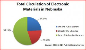
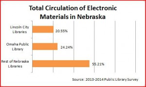
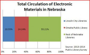
The Dude did a few quick charts in Excel for the purpose of demonstration (see right), and here is a brief example of a situation where a pie chart might be a more effective method to displaying the data and get your point across. The following charts show the circulation of electronic materials in Nebraska, using data from last year’s public library survey. Which one more effectively illustrates the data? If you are considering a pie chart, let’s summarize a few basic points.
Number 1: Keep it simple. Skip the 3d crap options that excel has if you are doing it in excel. This is analogous to the presenter using every, and I mean every, transition between power point slides (the fade, flip, dissipate, well, you get the idea). It’s almost as annoying as a single person (or family of 2 or even 4 for that matter) driving a
GMC Yukon Denali. Unless, of course, the
Denali is fitted with
baller rims or you should happen to be visiting the summit of Mauna Kea.
Number 2: Label things and provide your sources, but don’t go overboard. The key here is that your chart should be readable. You be the judge of that.
Number 3: Don’t have too many slices in your pie chart. There are countless examples of too many slices.
Here is one from the Australian Recording Industry Association (ARIA) Music Awards.
Number 4: Consider an alternative such as bar, stacked bar (a/k/a Don Draper’s living room), or
just numbers (make them large and add some color). If you have numerous charts in your report, try mixing it up with different charts or even use some tables. Don’t make every chart a pie chart (or a bar chart for that matter).
Number 5: If the pie doesn’t work, resist the urge to replace it with a
donut chart. Remember that a donut chart is just a pie chart with the unnecessary “premium” trim package. This is like a Lexus instead of a Toyota. It’s all the same.
Number 6: Pie charts aren’t the best choice when making comparisons (side by side pie charts don’t work as well as, say a bar chart).
Number 7: Pie charts have 25% built in – everyone knows where 25%, 50%, and 75% are on a pie chart. Keep that in mind if your data is close to those ranges.
Number 8: Always include citations to your sources.
Shaka.


 A lot of so called data presentation experts have taken to bashing the use of the pie chart. Notably, data man Edward Tufte has led this crusade, proclaiming that “the only thing worse than a pie chart is several of them.” Perhaps a bit more subtle, Stephen Few has written a lengthy tirade called Save the Pies for Dessert. While it might be easy to conclude that because someone with Tufte’s or Few’s credentials believe that pie charts are rubbish then it holds that they are in fact rubbish, such a generalization would be a good example of the logical fallacy ad verecundiam (appeal to authority). The Dude won’t fall into that trap, and Tufte won’t get a free pass either. The truth of the matter is that pie charts can be effective, as long as they illustrate the point that you are trying to make and you follow some simple rules.
The Dude did a few quick charts in Excel for the purpose of demonstration (see right), and here is a brief example of a situation where a pie chart might be a more effective method to displaying the data and get your point across. The following charts show the circulation of electronic materials in Nebraska, using data from last year’s public library survey. Which one more effectively illustrates the data? If you are considering a pie chart, let’s summarize a few basic points.
Number 1: Keep it simple. Skip the 3d crap options that excel has if you are doing it in excel. This is analogous to the presenter using every, and I mean every, transition between power point slides (the fade, flip, dissipate, well, you get the idea). It’s almost as annoying as a single person (or family of 2 or even 4 for that matter) driving a GMC Yukon Denali. Unless, of course, the Denali is fitted with baller rims or you should happen to be visiting the summit of Mauna Kea.
Number 2: Label things and provide your sources, but don’t go overboard. The key here is that your chart should be readable. You be the judge of that.
Number 3: Don’t have too many slices in your pie chart. There are countless examples of too many slices. Here is one from the Australian Recording Industry Association (ARIA) Music Awards.
Number 4: Consider an alternative such as bar, stacked bar (a/k/a Don Draper’s living room), or just numbers (make them large and add some color). If you have numerous charts in your report, try mixing it up with different charts or even use some tables. Don’t make every chart a pie chart (or a bar chart for that matter).
Number 5: If the pie doesn’t work, resist the urge to replace it with a donut chart. Remember that a donut chart is just a pie chart with the unnecessary “premium” trim package. This is like a Lexus instead of a Toyota. It’s all the same.
Number 6: Pie charts aren’t the best choice when making comparisons (side by side pie charts don’t work as well as, say a bar chart).
Number 7: Pie charts have 25% built in – everyone knows where 25%, 50%, and 75% are on a pie chart. Keep that in mind if your data is close to those ranges.
Number 8: Always include citations to your sources.
Shaka.
A lot of so called data presentation experts have taken to bashing the use of the pie chart. Notably, data man Edward Tufte has led this crusade, proclaiming that “the only thing worse than a pie chart is several of them.” Perhaps a bit more subtle, Stephen Few has written a lengthy tirade called Save the Pies for Dessert. While it might be easy to conclude that because someone with Tufte’s or Few’s credentials believe that pie charts are rubbish then it holds that they are in fact rubbish, such a generalization would be a good example of the logical fallacy ad verecundiam (appeal to authority). The Dude won’t fall into that trap, and Tufte won’t get a free pass either. The truth of the matter is that pie charts can be effective, as long as they illustrate the point that you are trying to make and you follow some simple rules.
The Dude did a few quick charts in Excel for the purpose of demonstration (see right), and here is a brief example of a situation where a pie chart might be a more effective method to displaying the data and get your point across. The following charts show the circulation of electronic materials in Nebraska, using data from last year’s public library survey. Which one more effectively illustrates the data? If you are considering a pie chart, let’s summarize a few basic points.
Number 1: Keep it simple. Skip the 3d crap options that excel has if you are doing it in excel. This is analogous to the presenter using every, and I mean every, transition between power point slides (the fade, flip, dissipate, well, you get the idea). It’s almost as annoying as a single person (or family of 2 or even 4 for that matter) driving a GMC Yukon Denali. Unless, of course, the Denali is fitted with baller rims or you should happen to be visiting the summit of Mauna Kea.
Number 2: Label things and provide your sources, but don’t go overboard. The key here is that your chart should be readable. You be the judge of that.
Number 3: Don’t have too many slices in your pie chart. There are countless examples of too many slices. Here is one from the Australian Recording Industry Association (ARIA) Music Awards.
Number 4: Consider an alternative such as bar, stacked bar (a/k/a Don Draper’s living room), or just numbers (make them large and add some color). If you have numerous charts in your report, try mixing it up with different charts or even use some tables. Don’t make every chart a pie chart (or a bar chart for that matter).
Number 5: If the pie doesn’t work, resist the urge to replace it with a donut chart. Remember that a donut chart is just a pie chart with the unnecessary “premium” trim package. This is like a Lexus instead of a Toyota. It’s all the same.
Number 6: Pie charts aren’t the best choice when making comparisons (side by side pie charts don’t work as well as, say a bar chart).
Number 7: Pie charts have 25% built in – everyone knows where 25%, 50%, and 75% are on a pie chart. Keep that in mind if your data is close to those ranges.
Number 8: Always include citations to your sources.
Shaka. 
