Shaka. Today, the Dude will focus on Google motion charts. This may be a complex or simple matter (depending on your perspective and degree of tech-savviness). It also may depend on your interest in data displays, which might currently be in the toilet after looking at all the survey data you have been reporting. This won’t stop the Dude from making a feeble attempt to show how the data you collect and report might be valuable to illustrate library trends, and that may rescue those that hold to the belief that there is excessive frivolity in the survey reporting.
First, some background information (or filler material). The Dude was introduced to the motion chart (aka interactive bubble chart) by
Hans Rosling’s TED talk. Watch it and you will be entertained. The software for the bubble (or motion) chart was created by Rosling’s
Gapminder Foundation. In 2007, the motion chart was acquired by Google, and now anyone can create these interactive charts with a free Google account. The Dude will skip the steps on how to get the data into the chart (that will be saved for another day), but basically you load a spreadsheet and tweak the columns a bit.
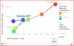
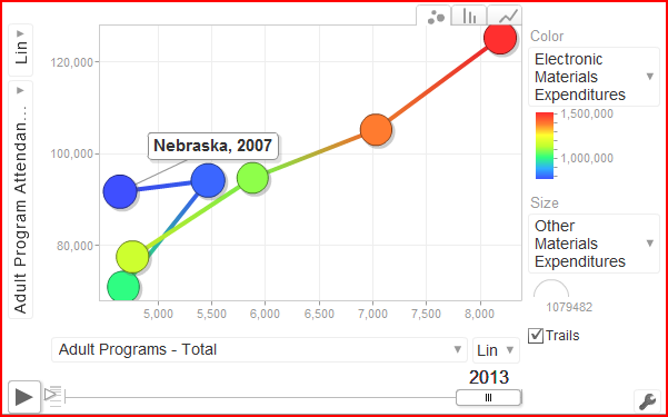
The chart above is a static version from a
motion chart the Dude created with the data from the Nebraska public library surveys from 2007 to 2013. It encompasses all the reported data for libraries in the state. The bubble (in this case there is only one, but you can add many more if you create your own chart) represents the size of the entity (typically population, and in this case the total legal service population of Nebraska libraries). There are two axes and the data for either one can be changed by clicking on the little arrow next to the description. There is a slider at the bottom that has a play button to set everything in motion by time. When you do this, the bubble moves either up or down depending on the changes in the data on the vertical axis. Simultaneously, the bubble moves either left or right, depending on changes in the data on the horizontal axis. In this example, the Dude compared the number of adult programs to adult program attendance (if you load the actual motion chart from the link above, you will have to select this from the menu bars on the left and the bottom). As you can see from the static image, programs went up with attendance remaining mostly the same from 2007 to 2008, then there was a decrease in programs
and attendance from 2008 to 2009, and then a nice, consistent increase in both from 2010-2013.
As with anything else, sometimes the motion chart might not always be the best choice for your data visualization. Andrew Abela has created this
nifty chart chooser to help you decide what visualization you might want to use, depending on what trend you might like to show. The Dude is working on more motion charts, with more bubbles, perhaps to take the public library survey data and illustrate all the libraries and their data together, or perhaps just a particular library and its peers. Any feedback on this project would be nice to have, and if any of you need assistance with motion charts, feel free to let me know.
 Shaka. Today, the Dude will focus on Google motion charts. This may be a complex or simple matter (depending on your perspective and degree of tech-savviness). It also may depend on your interest in data displays, which might currently be in the toilet after looking at all the survey data you have been reporting. This won’t stop the Dude from making a feeble attempt to show how the data you collect and report might be valuable to illustrate library trends, and that may rescue those that hold to the belief that there is excessive frivolity in the survey reporting.
First, some background information (or filler material). The Dude was introduced to the motion chart (aka interactive bubble chart) by Hans Rosling’s TED talk. Watch it and you will be entertained. The software for the bubble (or motion) chart was created by Rosling’s Gapminder Foundation. In 2007, the motion chart was acquired by Google, and now anyone can create these interactive charts with a free Google account. The Dude will skip the steps on how to get the data into the chart (that will be saved for another day), but basically you load a spreadsheet and tweak the columns a bit.
The chart above is a static version from a motion chart the Dude created with the data from the Nebraska public library surveys from 2007 to 2013. It encompasses all the reported data for libraries in the state. The bubble (in this case there is only one, but you can add many more if you create your own chart) represents the size of the entity (typically population, and in this case the total legal service population of Nebraska libraries). There are two axes and the data for either one can be changed by clicking on the little arrow next to the description. There is a slider at the bottom that has a play button to set everything in motion by time. When you do this, the bubble moves either up or down depending on the changes in the data on the vertical axis. Simultaneously, the bubble moves either left or right, depending on changes in the data on the horizontal axis. In this example, the Dude compared the number of adult programs to adult program attendance (if you load the actual motion chart from the link above, you will have to select this from the menu bars on the left and the bottom). As you can see from the static image, programs went up with attendance remaining mostly the same from 2007 to 2008, then there was a decrease in programs and attendance from 2008 to 2009, and then a nice, consistent increase in both from 2010-2013.
As with anything else, sometimes the motion chart might not always be the best choice for your data visualization. Andrew Abela has created this nifty chart chooser to help you decide what visualization you might want to use, depending on what trend you might like to show. The Dude is working on more motion charts, with more bubbles, perhaps to take the public library survey data and illustrate all the libraries and their data together, or perhaps just a particular library and its peers. Any feedback on this project would be nice to have, and if any of you need assistance with motion charts, feel free to let me know.
Shaka. Today, the Dude will focus on Google motion charts. This may be a complex or simple matter (depending on your perspective and degree of tech-savviness). It also may depend on your interest in data displays, which might currently be in the toilet after looking at all the survey data you have been reporting. This won’t stop the Dude from making a feeble attempt to show how the data you collect and report might be valuable to illustrate library trends, and that may rescue those that hold to the belief that there is excessive frivolity in the survey reporting.
First, some background information (or filler material). The Dude was introduced to the motion chart (aka interactive bubble chart) by Hans Rosling’s TED talk. Watch it and you will be entertained. The software for the bubble (or motion) chart was created by Rosling’s Gapminder Foundation. In 2007, the motion chart was acquired by Google, and now anyone can create these interactive charts with a free Google account. The Dude will skip the steps on how to get the data into the chart (that will be saved for another day), but basically you load a spreadsheet and tweak the columns a bit.
The chart above is a static version from a motion chart the Dude created with the data from the Nebraska public library surveys from 2007 to 2013. It encompasses all the reported data for libraries in the state. The bubble (in this case there is only one, but you can add many more if you create your own chart) represents the size of the entity (typically population, and in this case the total legal service population of Nebraska libraries). There are two axes and the data for either one can be changed by clicking on the little arrow next to the description. There is a slider at the bottom that has a play button to set everything in motion by time. When you do this, the bubble moves either up or down depending on the changes in the data on the vertical axis. Simultaneously, the bubble moves either left or right, depending on changes in the data on the horizontal axis. In this example, the Dude compared the number of adult programs to adult program attendance (if you load the actual motion chart from the link above, you will have to select this from the menu bars on the left and the bottom). As you can see from the static image, programs went up with attendance remaining mostly the same from 2007 to 2008, then there was a decrease in programs and attendance from 2008 to 2009, and then a nice, consistent increase in both from 2010-2013.
As with anything else, sometimes the motion chart might not always be the best choice for your data visualization. Andrew Abela has created this nifty chart chooser to help you decide what visualization you might want to use, depending on what trend you might like to show. The Dude is working on more motion charts, with more bubbles, perhaps to take the public library survey data and illustrate all the libraries and their data together, or perhaps just a particular library and its peers. Any feedback on this project would be nice to have, and if any of you need assistance with motion charts, feel free to let me know.

